
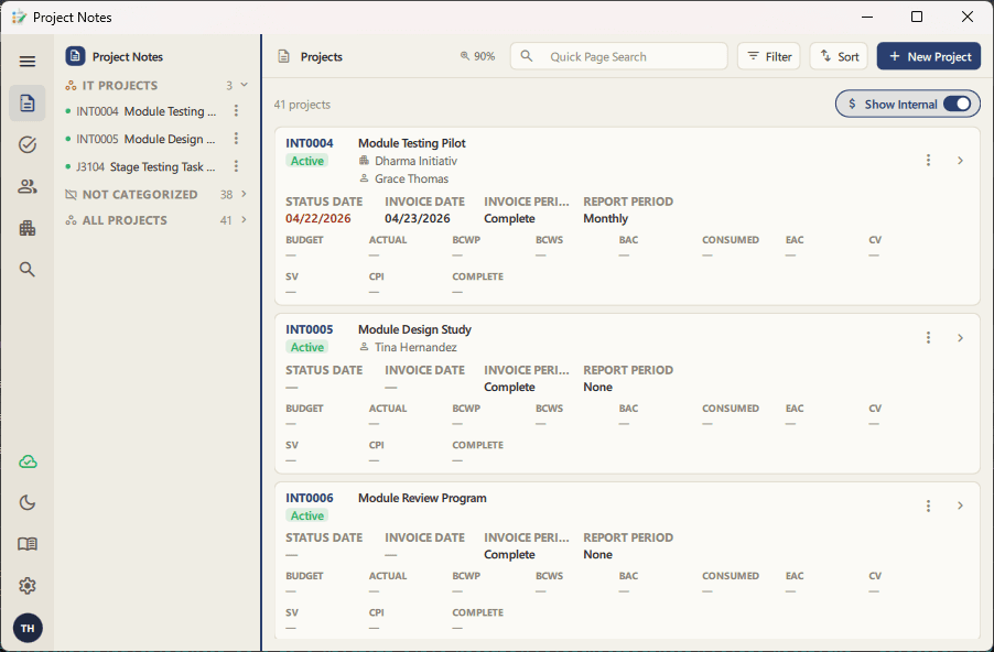
For years, ProjectNotes has done its job quietly: track your projects, your people, your risks and issues, and get out of the way. The old Qt Widgets interface was fast and it felt right at home on your desktop, borrowing your OS's own buttons, menus, and dialogs, and it never made you wait.
But "at home on your desktop" started to feel like "stuck in the past." Native controls meant native limitations: dense toolbars, modal dialogs that froze everything else, and a visual language that hadn't really changed since the app was first built. It worked. It just wasn't enjoyable.
Today we're shipping a complete overhaul of the ProjectNotes desktop experience. It's a ground-up rebuild of the interface on Qt Quick/QML, designed to feel modern, fast, and genuinely pleasant to use every day. The data, the reliability, and the plugin ecosystem are all the same. Only the face is new.
Why we rebuilt it
Native controls are efficient, but they're also rigid. You get what the operating system gives you, and every platform gives you something slightly different. Moving to QML let us design one interface, render it identically on Windows and macOS, and finally build the things a native toolkit makes painful: smooth animations, card-based layouts, a real dark mode, live inline editing, and a UI that scales cleanly for screen-sharing and presentations instead of turning into a blurry mess.
None of that came at the cost of what made the old app good. It's still a single, fast, offline-first desktop app talking to the same SQLite database, with the same cloud sync underneath and the same Python plugin system on the side.
What's new
A sidebar that works the way you organize
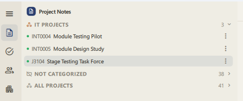
Projects now live in a resizable sidebar with drag-and-drop folders. Group projects however makes sense to you, put one project in multiple folders, collapse the groups you're not using, and the layout remembers what you did the next time you open the app.
Project details, reorganized
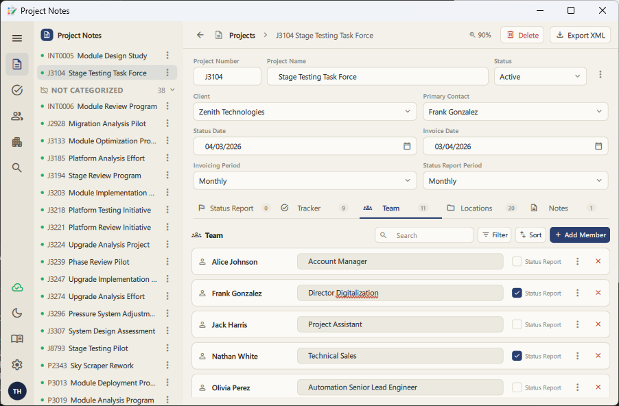
The project detail page is now tabbed into Status, Tracker, Team, and Notes, with the essentials (number, name, status, client, dates) always visible above the tabs so you're never hunting for context. Budget, actuals, BCWP, and EAC render as clean metric tiles instead of a dense spreadsheet row, and every tab carries a live count badge so you know what's inside before you click.
Editing happens where you're looking
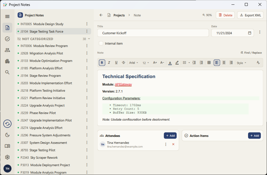
Nearly everything edits in place now, including names, dates, statuses, and comments. Dates get a real calendar picker instead of a text field. Notes get a rich formatting toolbar with font, size, color, and now a choice of bullet and numbering styles for lists. Misspellings get an actual red squiggle you can right-click to fix, add to your dictionary, or ignore. The old interface's spell-checker never quite pulled that off visually.
A theme that fits the room you're in
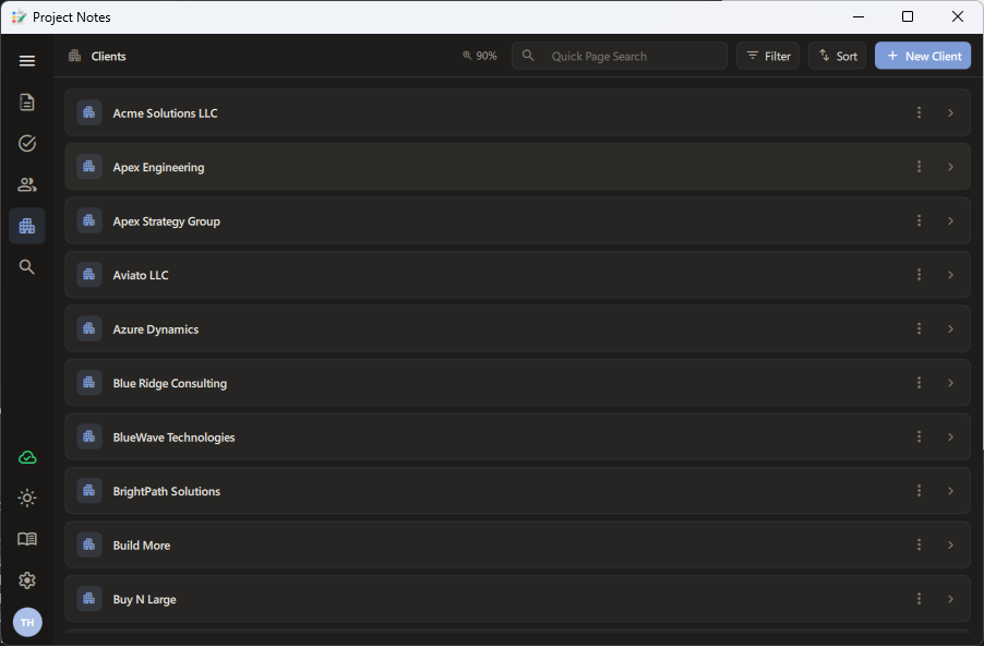
Light and dark themes are built in from the ground up. Rather than a palette swap bolted onto native widgets, it's a design system with consistent spacing, color, and iconography (Material Symbols) across every page.
Built for sharing your screen
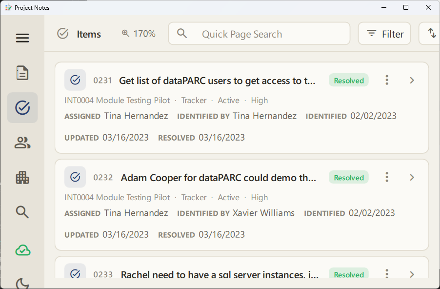
Presenting a project status to a room, or hopping on a call to walk someone through an issue? Ctrl and the scroll wheel (or Ctrl +/− and Ctrl+0) now zoom the entire interface. Rather than a blurry pixel-doubled zoom, it's a real reflow that keeps every label sharp and legible at any size.
Right-click, everywhere it should be
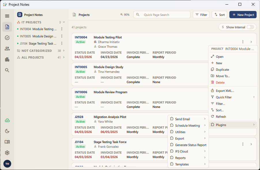
Context menus are back where you expect them. Right-click a project, a person, a tracker item, or a note to open, duplicate, delete, export, filter, or jump straight to a related record. Your installed plugins show up in the same menu, exactly like before.
Everything else you rely on, still here
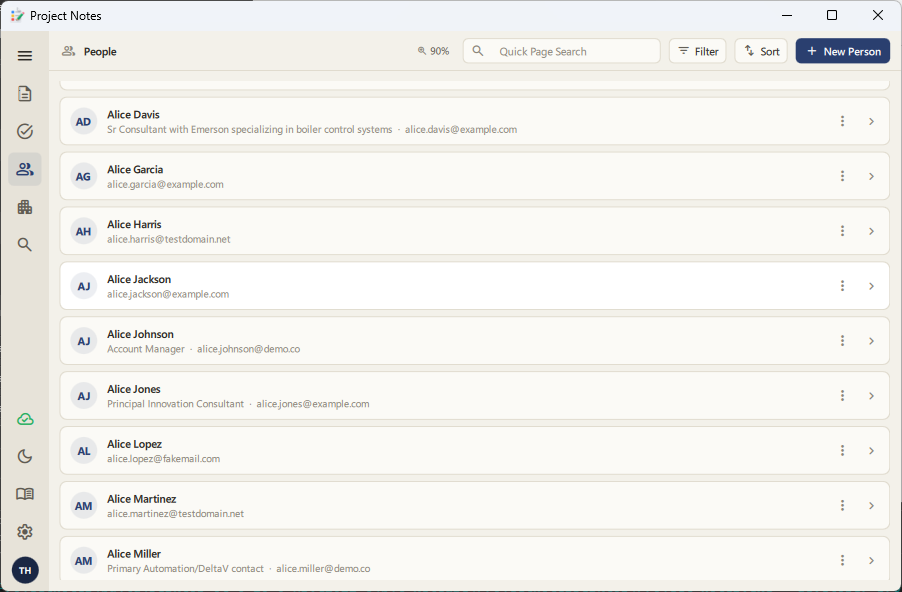
Global search across people, clients, projects, and items. Column filtering with searchable value lists and date ranges. Cloud sync with a live status indicator in the icon rail. Automatic update checks. XML import/export. Your Python plugins. All of it carried over, just wrapped in an interface that finally looks like it belongs in 2026.
What stays the same
Your data doesn't move. The same SQLite database, the same sync engine, the same plugin API. If you've built internal plugins or automation against ProjectNotes, they keep working without changes.
Try it
The new interface ships as the default desktop build starting today. Update ProjectNotes and it's simply what opens. There's no separate download, no migration step, and no settings to change.
We think it's a genuinely more enjoyable way to work. Let us know what you think.
Written by Paul McKinney, founder of Project Notes Pro. Try it free at projectnotespro.com.